
skills
typography | color | grids | composition | information architecture
tools
illustrator | indesign
The goal of this project was to use mini-assignments to develop technique and explore the fundamentals of design. Assignments begin with a basic letter task, and eventually progress to creating entire compositions.
These deceivingly simple exercises were both fun and frustrating. Because only a few elements were in play, there was a greater focus on design technique and the purpose of every single decision.
Typography


The first assignment involved placing a letter within three square boxes, progressing from most legible to least legible. I chose the letter R, the first letter of my name and decided to enlarge it each time. I noticed during critique was that there was an animative movement about the composition of the three R’s, as if one is tumbling across the screen. Although this was a simple task, I found it valuable to learn that I could create movement out of simply placing letters a certain way on the screen.
Composition


Moving past type, the second assignment focused on the composition of text within a page, using grids, weights, and alignment. I experimented with three different compositions, with each having its own subtle tone presented to the reader. The different sizes of title, heading, and body text create an information hierarchy for the reader, while the heading allows for multiple entry points. By far my favorite composition was the third, which utilizes a more geometric approach.
Color - Call to Action


Building upon type and composition, we transition to color. The first part of this exploration allowed me to manipulate paper to create hue and value changes in a visual illusion. On the left, the juxtaposition of the purple and pink caused the smaller violet square to appear to be two different hues when placed on different backgrounds. In reality, they are the same hue. On the right, the same process is used, but to create a value change even though the two smaller orange squares are the same value.
This was not only an insightful exercise, but also a fun one. Even just focusing on physical paper can reveal techniques on the usage of color.
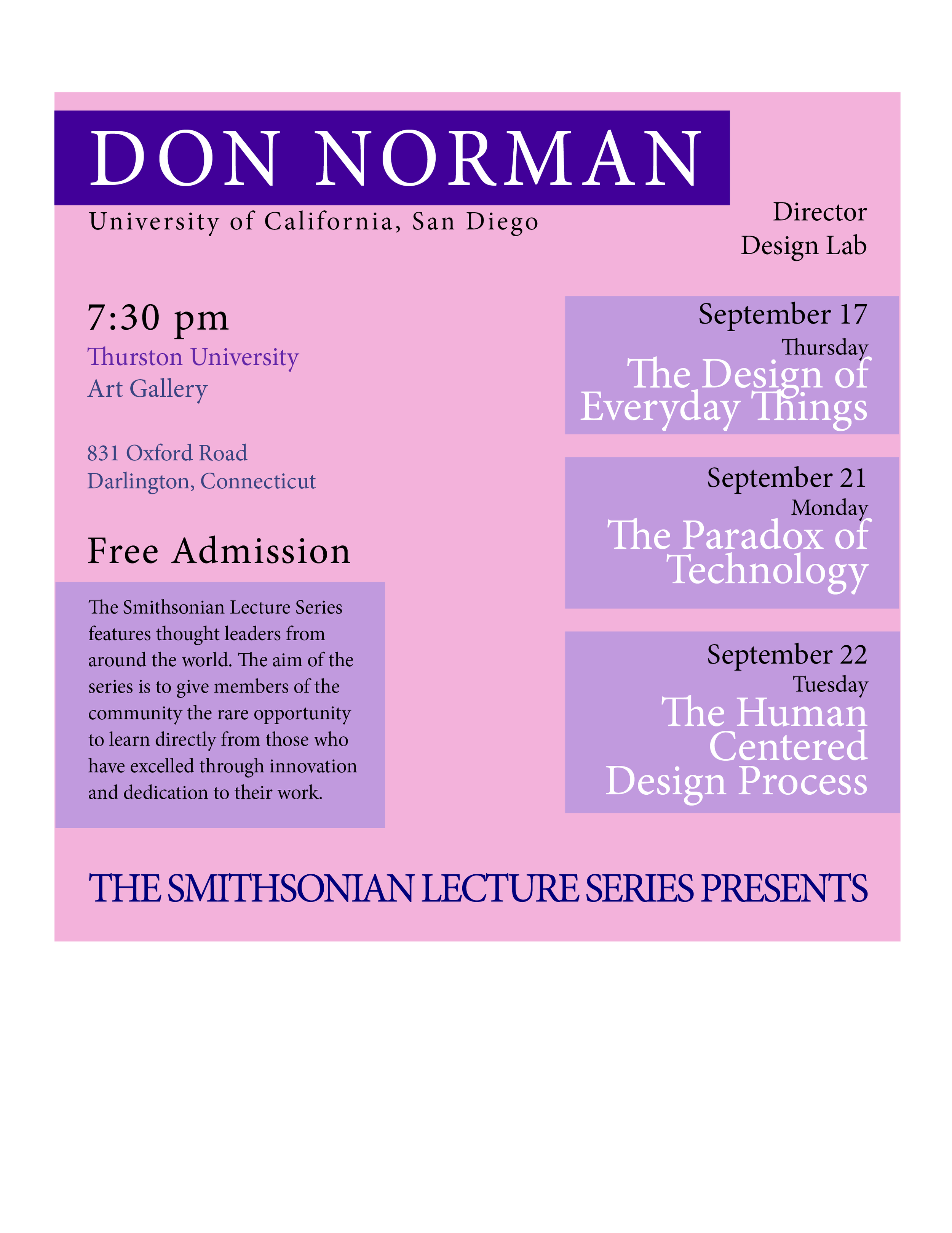


For the second part of the color assignment, I was tasked to create a poster advertising a new Smithsonian Lecture Series featuring Don Norman. We were given information about the event and constructed three separate potential posters. After doing some research, I found what the Smithsonian colors were and incorporated them into my design. In addition, I focused on grid composition and creating a clear hierarchy of information. This required me to think about what the Smithsonian would want advertised to promote the event, and what people would want to look for first. This included things like free admission, the lecturer, and the topics of discussion.
Information Architecture


Finally, the last phase of these exercises took a look at data organization. After being given a list of 100 people with their years of age and profession(s), I used a spreadsheet to group the information into categories. The first iteration was rather simple: gender, and then alphabetical. The second built upon this and included information about profession. Being able to visualize and organize data can be extremely useful to designers when they are working on structuring and presenting information to convey meaning.